Which mobile ads catch the consumer's eye?
Viewability is a prized metric, but it doesn't tell the whole story. A new study used biometric technology to see what kinds of mobile ads really resonate.
Author: Mike O'Brien
The average American checks their phone every 12 minutes and as a result, marketers spend billions of dollars a year on mobile ads. But how effective are those ads?
Viewability is an important metric for marketers and the Interactive Advertising Bureau (IAB) has extremely detailed guidelines as to what constitutes an impression. But that doesn’t tell the whole story. While viewability lets advertisers know that their ad appeared on a screen, they can’t be sure the ad caught the consumer’s eyes. More importantly, viewability doesn’t determine whether the ads actually resonate.
“We talk about ad exchanges, DMPs, cookies, onboarding: all the technology underneath billions of dollars of acquisitions,” says Ryan McConville, President and Chief Operating Officer of mobile ad company Kargo. “But the only part of the industry people see are the ads themselves. Marketers spend so much time audience layering, but they leave out the most important part. What is the creative going to look like when people see it?”
Animated mobile ads: The top performers
There are countless variations of mobile ads. Kargo teamed up with MediaScience up to figure out which formats were the most effective. However, they didn’t just survey people. Because MediaScience is a neuroscience firm, they were also able to use biometric technology to determine which ads caught people’s eyes, and affected their blood pressure and heart rate.
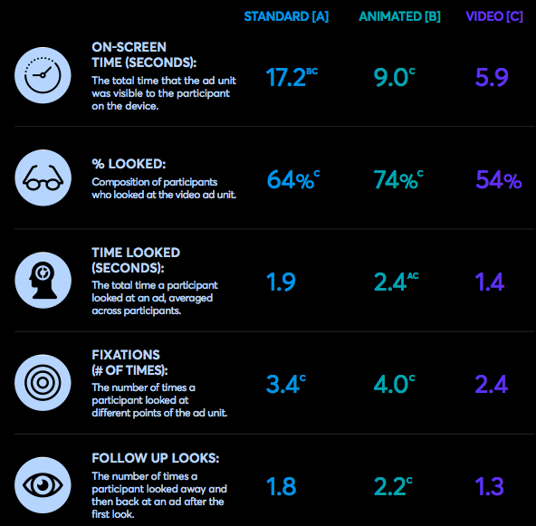
More than 200 consumers were tasked with reading five editorial articles, which contained nine different types of ads, a mix of static, animated and video. Respondents were connected to eye recording and biometric recording devices that captured data including which participants’ eyes focused on ad units, how many times and for how long.

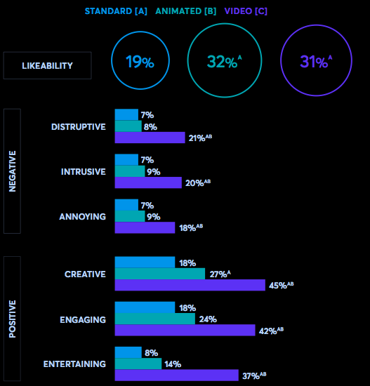
Static ads got the most screen time, which makes sense, given their smaller size, but animated ads got more views. Three-quarters of people actually looked at them. Animated ads also outscored their static counterparts in both positive (entertaining, engaging) and negative (annoying, interruptive) categories. However, the difference was far greater on the positive side. Why?
It makes sense to Yoni Levy, VP Managing Director of Digitaland, a creative agency focused on rich media. In his opinion, animated ads are a happy medium in between static display and video advertising.
“With rich media, you can catch people’s attention without asking for too much of their time,” he says. “Because attention spans are so low now, getting someone to watch a 30-second video isn’t an easy task.
“Consumers aren’t banner blind; they’re banner bored,” he adds. “If you see 300 banners a day with static images and no storytelling, you’re not going to invest your attention.”
Mobile video ads: The most polarizing
Notice Levy used the word “invest.” Attention is like currency for marketers and the stakes are higher on mobile devices. The screens are much smaller, so it’s easier to catch someone’s eye. But at the same time, that makes it far easier to disrupt whatever they’re doing and turn them off.
That explains video ads, by far the most polarizing format, according to Kargo and MediaScience’s research. Though video ads got the least amount of screen time, when it came to ad recall, they also scored the highest in both the positive and negative categories.
“Video has this bizarre trade off where it might be entertaining, but it can also be like a blunt object,” says McConville. “Certain video formats actually thread the needle where marketers can deliver the good without the bad.”
In his opinion, those certain formats are like what you’d see on Instagram. The monumentally photo-sharing platform requires marketers to build ads specifically for Instagram, which has an effect on the overall experience.
It’s also worth noting that Instagram also has the highest engagement among social media platforms.
“Ads that are optimized in size to appear native to a phone screen—a full bleed to the edge of the pages, not looking like a shrunk-down desktop ad, not a ‘French fry’ banner—perform far better than the industry average,” he says. “Too many marketer take desktop ads and lazily throw them on a DSP.”
Ref: www.clickz.com

