6 Web Design Trends That Are Here To Stay

Web design thrives on two things: innovation and imitation. Unfortunately, there's often a lot more of the latter. We all like to seize upon the latest trends, use them until they’re ubiquitous, and then look desperately for the next big thing. Think about sliders. They were all the rage a couple years ago. Today, they feel dated. What to do? Stop chasing microtrends, and start looking at the big picture. Here, we've isolated six web design ideas that are here to stay.
1. Artificial Intelligence
Context is everything. Where and when an interaction happens is now as important as how or why. Is it on a phone? A tablet? Indoors or outdoors? What is the user doing in that moment? Users interact with a product in all kinds of different situations.
Designers have to make the product's response as seamless and as helpful as possible. Of course, they can’t instantaneously read a user’s context in real time. But sophisticated and emergent artificial intelligence engines can. Such as:
Many other forms of artificial intelligence are beginning to automate the web. The eventual outcome: a greater reliance on AI to analyze and interpret user context, and then coordinate the best offers and solutions.
Consider the development of online virtual assistants. Seamless speech interpretation and instantaneous responses to user requests are some of the biggest challenges designers are working on today. Programs like Cortana, Siri, and GoButler are racing to obliterate our ability to discern between man and machine. Virtual assistants such as these will have a tremendous impact on how users interact with web and mobile apps.
AI newbies can get started by using various WordPress plugins like The Client Relations Factory, which puts an animated, autonomous customer-service representative on your website.
2. Diversity
One consistent complaint about the web design world is how often it engages in, shall we say, less than original practices.
The proclivity of WordPress templates, responsive frameworks, and the desire to achieve a certain look (corporate, personal, portfolio, etc.) has led to a large degree of uniformity in design. This can only last so long.
Websites don’t have to fit into a mold. Certainly there will be clients who’ll want their websites to match others in the same industry. But there are always calls for a fresh take—for something that feels different. Of course, many of these requests are only for superficial differences. However, as the web design industry matures, it’s only natural that it should diversify in earnest.
This doesn’t mean you need to start putting together abstract designs for novelty’s sake. Rather, you should feel free to push boundaries, while holding onto the basics that make for a smooth user experience.
One space where this trend is taking off is in theatrical presentations.
The website for a documentary called Sons of Gallipoli, for instance, has unique navigation and presentation.
Video controls show progress in a semi-transparent overlay while the documentary is still playing.
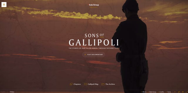
The site also features unique layouts, grids on demand, CSS3 animations, and a number of other design touches. However, you’ll notice that it doesn’t forsake usability. The site is still easy to navigate.
3. Rich Illustrations
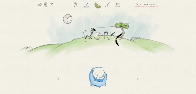
Traditionally, websites use stock photography and other photos for visuals. Moving forward, we will start to see more hand-drawn art.
Hand-drawing offers warmth and a degree of originality that simply can’t be met with other visuals. As companies vie for consumers' hearts (and dollars), websites that convey an air of authenticity will be king.
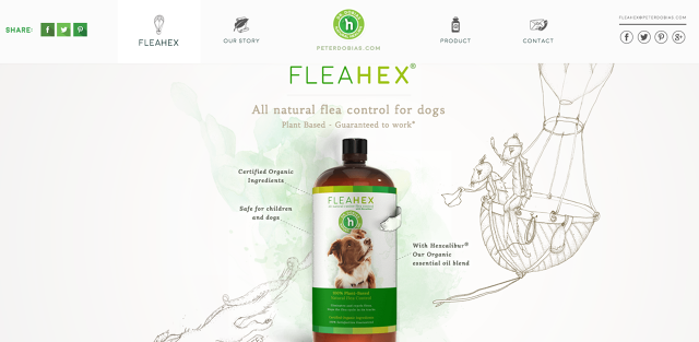
Soon, websites and their brands could be associated with the art style they contain. For example, note how the FleaHex website’s art style (pictured below) resembles the design company that created it (pictured above). Imagine a world in which Picasso’s blue period plays out digitally for all to see and appreciate. Integrating handmade artwork in web design can become something of a branding calling card.
4. Mobile/Wearable First
Mobile-first design is already well underway, but it will become even more pronounced as the wearables market, which is estimated to be worth $31 billion by 2020, heats up. Google Glass may have fallen flat, but HUD displays aren’t going to disappear completely. Not with Oculus Rift and other VR tech coming to the fore. And that's only part of the wearables story.
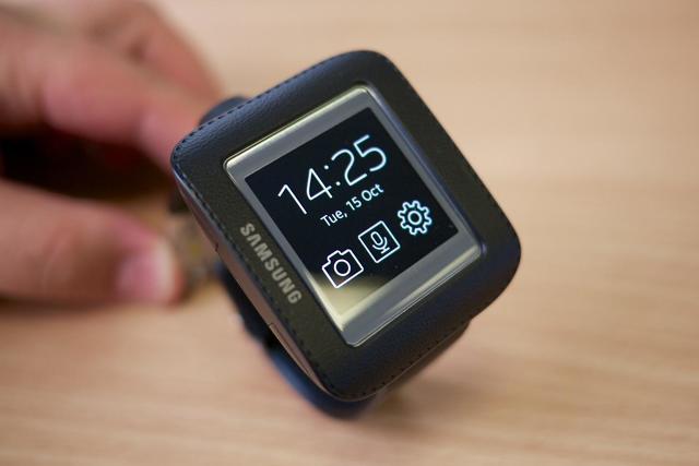
These platforms present a whole new set of challenges for designers making applications and websites accessible. Of course, the basic principles of good UI design still matter. But designers will have to come up with creative ways to accommodate smaller, oddly sized screens and interfaces.
5. Microinteractions
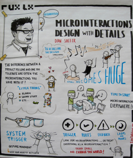
As information becomes platform-agnostic—available on our watches, our phones, our TVs, and everything in between—seamless user experiences will be more important than ever. Enter microinteractions, those "... momentary events that all add up to create the final experience," as detailed here.
Microinteractions have to feel as unobtrusive as possible. They should require a dearth of thought and effort on the part of the user. They can be achieved in a few clicks or perhaps a more thorough process. In either case, a microinteraction should consist of four steps:
- Trigger
- Rule
- Feedback
- Loop/Mode
The trigger is the initiating action, such as a "read more" button or a notification. The rule is the predefined constraints that govern the interaction. This is usually intuitive, like the ubiquitous hamburger icon. A rule can also be a form that a user might need to fill out. Feedback is the response to the user’s action, and the loop is how long the interaction lasts or whether it’s repeated. Modes are necessary disruptions from the microinteraction. They’re usually unwanted, and should be used sparingly, if at all.
6. Richer animations
Finally, we get to the good stuff. The whole point of design is to look good after all. And what looks better than rich animations? The web has never looked more dynamic than it does today, and it's only going to get better.
Animations engage the user and enhance storytelling. They make a website seem more like an interactive experience than a simple portal to find information about a certain business, product, service, or individual.
Of course, it’s important not to go overboard. Too much movement can scatter focus, and distract, confuse, and irritate users. Keep animations simple and thematically consistent. When I say "thematically" I mean from a storytelling perspective. Your site should unfold like a well-told narrative, revealing important details and guiding users through a path . Use animations selectively to illustrate important points or to indicate a required action.
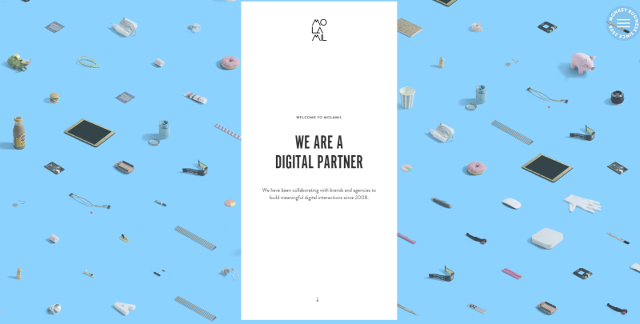
For example, the website molamil.com uses animations to highlight transitions. On their homepage they begin by introducing their brand and then animate the transition to different entries in their portfolio.
