How Can We Make Design Better for the Colour-Blind?

A quiet but staggering statistic: Eight percent of all men and 0.5 percent of women experience some form of colorblindness. What can design do to help them?
Editor’s note: Matteo Farinella, who created the header illustration for this article, combines his PhD in neuroscience with his artistic skill to visualize complex scientific concepts. In his words, “This image maps the ‘perceptual confusion’ of colorblindness to a ‘geographical confusion’ that we can all relate to. The three colors here are represented as three hills, covered in photoreceptors. While the blue hill is clearly visible, the paths leading to the red and green hills are not as easy to follow. It’s in that forest of red-green midtones where colorblind people tend to get lost. So designers should try to avoid those tones.”
The plight of the color-blind designer seems like a daunting one. It’s a fairly common phenomenon. Out of necessity, the condition is often hidden from employers and colleagues by a large swath of artists and designers seeking to protect their professional reputations and keep their livelihoods from peril.
“I don’t want my colleagues to second-guess every design decision I make,” asserts Stan*, a graphic designer of 15 years. Color-blind, he prefers to remain anonymous. “I’ve learned to work in this industry despite having color issues, and it’s never once presented me with a professional hurdle I couldn’t overcome,” he says, referencing past digital and print work for top-tier brands such as PetSmart and Mars Candy. “The truth is I am color-blind and know several other designers who are as well, but we don’t publicize it.”
Were these designers to come forward, however, their potential contributions to the worlds of teaching, design, and general awareness would be considerable.
Color blindness is an inherited condition that limits a person’s ability to distinguish between color shades, most commonly reds and greens. Our ability or inability to recognize color is dependent on cells in our eyes called cones. There are three, each triggered by different wavelengths of light that send complex messages to the brain, which combined produce the appearance of color.
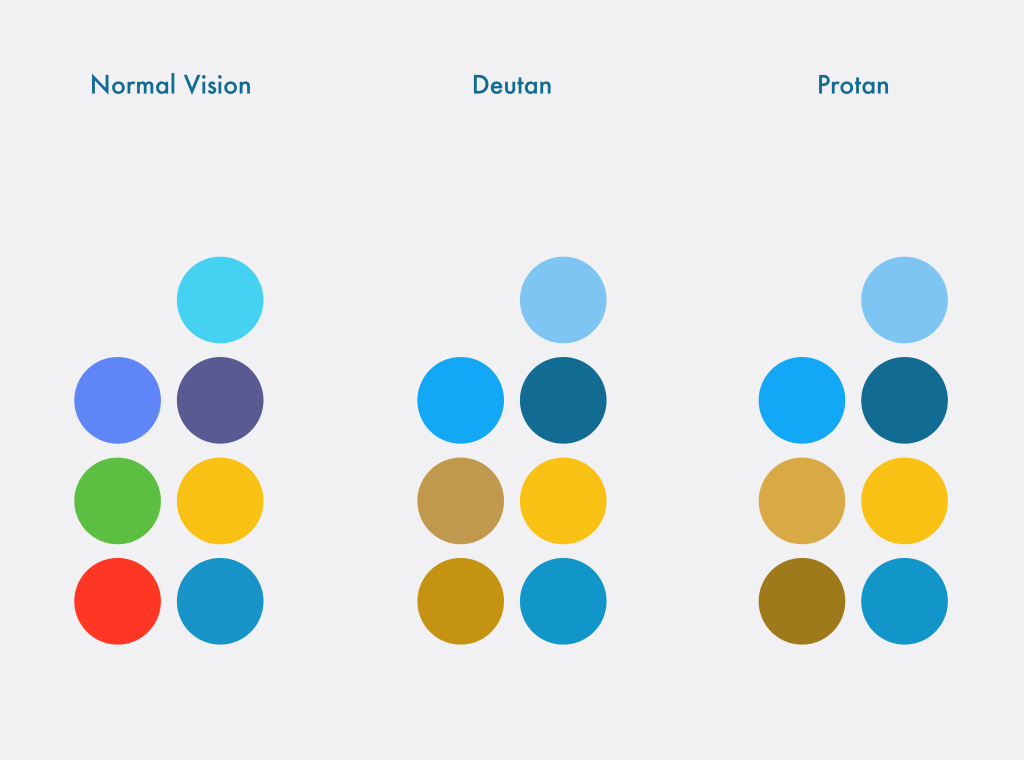
Image courtesy of EnCrhoma, which notes “Image colors are simulated. Red-green color deficiency varies by individual.”
A common misconception is that color-blind people can only see the world in black and white, a separate condition called monochromacy. In reality, color blindness works on a gradient, from difficulty discerning specific shades to an inability to recognize more than three or four colors. This neurological quirk is the result of a mutation on the X-chromosome. Since women have two X-chromosomes, one acting as a backup to counteract potential defects, they’re less likely to inherit the disorder, which typically manifests in three specific ways.
The most common is red/green color blindness, protanopia, where subjects have difficulty viewing red light and often confuse blues with purples. Deuteranopia works similarly but affects the ability to see green. Tritanopia, the least common, affects the ability to distinguish blue and yellow. According to statistics, while only one in 200 women worldwide is color-blind, one in 12 men, or approximately 8 percent of the global male population, have varying degrees of vision impairment.
For UX and graphic designers, this means that potentially eight out of every 100 visitors to a site or an app may be seeing and experiencing content differently than intended. For the color-blind, daily tasks like reading an onscreen message at the gas pump, with its green and red buttons, may be an exercise in confusion and frustration. Informed designers, on the other hand, have the power to meet this challenge head-on.
Most well-executed examples of color-blind-friendly design are so subtle you’d never even notice them. It’s the websites that indicate a clothing item’s color in the title, or the designer who utilizes texture instead of flat pigment in a pie chart. The most forward-thinking design companies have begun to create mobile games that contain a special color-blind mode to ensure inclusion, the most popular of which is Dots, a puzzle app aimed at matching colored dots. On the other hand, many productivity apps rely solely on colored labels to relay critical information and are next to impossible for the color-blind to navigate.
“Many designers aren’t aware of this disability, and even the ones who do don’t see it as important enough to consider adapting their design processes,” explains Matej Latin, a UX designer living in London. Latin initially kept his condition a secret, but emboldened by support from past and present coworkers, he now promotes color blindness awareness and accessibility on the web and social media. “A ‘colorblind designer’ sounds strange, but there’s a lot of us out there,” Latin explains, mentioning a blog post he wrote a few years ago titled “A tale of a colour blind designer.”
It quickly became popular, with designers writing in to express their own reluctance to come out as color-blind. “I still get at least one email each month. Designers are terrified of coming forward because they’re scared they’ll lose their job, or be seen as less capable,” says Latin. He can’t emphasize enough how wrong this is. If anything, he believes color-blind designers tend to do a better job of designing with users in mind, since “they can experience these issues themselves.”
His advice has been to stay quiet if you’re afraid of losing your job but has discovered it’s rarely an issue. “In most cases, they’ll find it fascinating,” he says. He believes color blindness helps him to make more deliberate choices and view what others can’t. “I can see immediately if the contrast in a user interface isn’t right,” he explains. “It’s jarring for me but not for non-color-blind colleagues. Being on the receiving end of a disability forces you to think more about the person who will use your product. And that’s essential for all good design work.”
In DOTS colorblind mode, colors are represented by symbols, allowing players to follow gameplay by connecting dots of the same symbol. Image courtesy of DOTS.
Multiple public resources also exist to better design for the color-blind. Founded in 2009, Usabilla was created to help marketers, designers, and UX practitioners generate more-accessible sites. Today, they offer tips on making websites easier to read for the color-blind. “Just like we wouldn’t exclude people who use a certain browser or device, we shouldn’t exclude those [who need] special accommodations,” Usabilla marketing manager Kathleen Hickey tells us. “Designing with inclusiveness and accessibility benefits everyone.”
She maintains that incorporating features that benefit those with special needs must be seen as an opportunity to embrace the core principles of the web, offering an improved experience for as many users as possible. “In the case of designing for color blindness, websites aren’t just meant to look good – they’re meant to be easy-to-use for everyone, including the color-blind.” Usabilla’s site contains easy-to-follow instructions and tips on designing for the color-blind, including directions for using both colors and symbols, limiting the color palette, utilizing different textures and contrasting patterns rather than multiple colors (especially for graphs and charts), and avoiding problematic color combos like green and black or blue and purple.
They point to Facebook’s easy-to-identify form fields and error messaging as an example of a particularly successful site. It’s rumored that the site’s iconic blue color scheme was specifically chosen to accommodate founder Mark Zuckerberg’s red-green color blindness.
Researchers are also working on gene therapies to help “correct” color blindness, most notably Jay Neitz, Ph.D., a professor of ophthalmology and a color vision researcher at the University of Washington in Seattle. In 2009, Neitz successfully administered an injection of cells into two squirrel monkeys lacking a gene known as L opsin, which provides information for the cones in the iris that perceive long wavelengths and red colors – the same cause of red-green color blindness in humans. Neitz’s team injected a virus carrying altered genetic information supplying the missing L opsin gene directly into the retina, and over the course of 24 weeks, the light sensitivity of the cones in the monkeys’ eyes shifted, permitting newfound color sensations. So far, the monkeys in this ongoing study have yet to exhibit any side effects. Beyond its importance to the study of colorblindness, the project is linked to larger research into gene therapies that may someday restore light perception to people afflicted with degenerative eye disorders. But we are still far from “curing” color blindness itself.
“People are desperate to find some solution,” Neitz told us, explaining that this condition leaves sufferers open to all kinds of “basic quackery.” He mentions EnChroma, a popular set of glasses that promises to enable viewers to “see” greater color ranges, citing its fundamental inability to change the neurological makeup of an individual.
While the glasses can filter out particular wavelengths of light and change the intensity of colors, they don’t permit you to see a new range of colors. “Some have tried on the glasses and say they like the way the world looks better,” he laughs, “but are they making people’s color vision better? No. The only way to make a significant improvement is to replace the photopigment that’s missing.” Ultimately, he says, people with normal color vision underestimate how much we depend on color for information, from witnessing fall foliage and viewing a beautiful painting to following critical directions.
Loren Long was in junior high when he had his eyes examined by an ophthalmologist and failed to pass the color test. The doctor, trying to cheer him up, joked that this would only be an issue if he wanted to be “an electrician, a dermatologist, or an artist.” Unfortunately, he had already discovered his passion, and talent, for painting. “My mom really helped, strongly affirming, ‘Hey your art is beautiful. Don’t let anybody say you can’t be an artist.’” Today, he’s an illustrator, writer, and New York Times best-selling picture book author. “I often talk about this moment when I give keynote speeches.”
“I realize my color blindness is an obstacle, but certainly not a disability,” he says. “When I’m making my color paintings, yes, it’s something that I have to deal with. But I’ve learned you can ask someone who has color vision to help.” Unable to use art supplies without the colors listed, for much of his career he kept his color blindness a secret. “I was always afraid they wouldn’t hire me. But those of us who are color-blind, we see most color – we just don’t see it the way you do. I see value, and it heightens my art. I see a fuller range. It’s given me an underdog mentality, which has served me. I’ve never taken anything for granted and always felt like I had to work hard and prove myself. I think for a person who’s creative, that’s a good mentality to have.”
Ref: 99u.adobe.com